Why did you select this character and this story for this book cover?
I selected this character because they never fully discribe how the "Beast" in lord of the flies looks. they give vauge discriptions, and this leaves lots of room for the creative process.
How would you describe the theme, mood or setting of the book?
The book is more of a darker theme, it takes place on an abandond desert island where all these 3rd grade boys must learn to survive.
How does your design reflect the theme, mood or setting of the book?
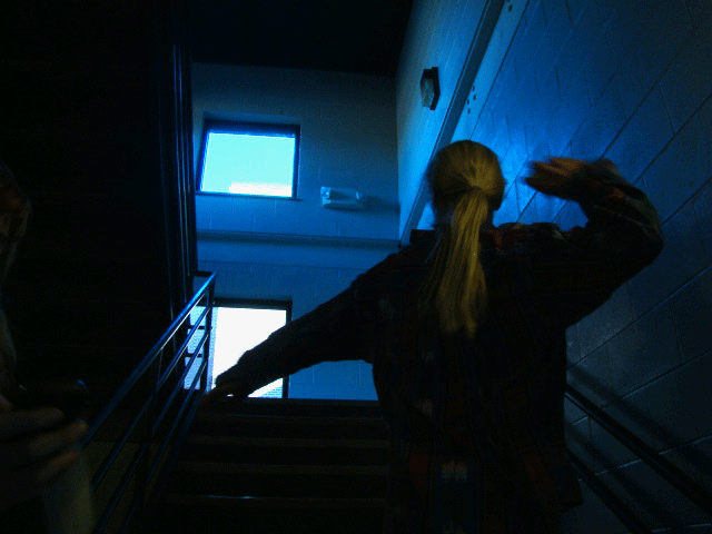
I chose colors that usually seem very bright and happy (pinks oranges, reds) and i layered them and burned them to have more of a darker more dreary theme. i usede the silouetes for the boys in the second book because it shows actions but cannot show facial experssions or modivations which shows mystery i think
Which font did you choose and how does it appeal to your target audience?
i chose two very different fonts in the two books i was asked to create. in the first one i used a cursive very formal font, only because that is the opposite of the book and all its themes. the second font matches the book and its themes almost perfectly. By choosing two themes that have opposite effects on the moods given off by the book