
Thursday, December 20, 2012
Friday, December 14, 2012

Wednesday, December 12, 2012

Tuesday, December 11, 2012

Monday, December 10, 2012

Thursday, December 6, 2012

Wednesday, December 5, 2012
third day of photoshop

Tuesday, December 4, 2012

second day of photoshop

Monday, December 3, 2012
For the First Day of Photoshop

Wednesday, November 28, 2012
no time like dancin time

Monday, November 26, 2012
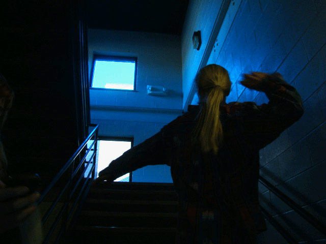
for my cinemagraph i am going to do someone jumping and frozen in time like this picture of james bond
 but im going to have a tree in the frame that moving in the wind while the subject stays in the air
for my second idea im going \- \- \- \- \- \- \- \- \- \- \- \- \- \- -\ \- -\ \- -\ -\ -\ \- -\ \- -\ \- -\ \- \ -\ -\- -\\- jklsdfa;a;gd satojkds vaf.snhlfkfjsd to do someone tossing an object but only their hands and the object is moving.

for my second idea im going \- \- \- \- \- \- \- \- \- \- \- \- \- \- -\ \- -\ \- -\ -\ -\ \- -\ \- -\ \- -\ \- \ -\ -\- -\\- jklsdfa;a;gd satojkds vaf.snhlfkfjsd to do someone tossing an object but only their hands and the object is moving.
Tuesday, November 20, 2012


Monday, November 19, 2012


Thursday, November 15, 2012

Tuesday, November 13, 2012


Book cover


Why did you select this character and this story for this book cover?
I selected this character because they never fully discribe how the "Beast" in lord of the flies looks. they give vauge discriptions, and this leaves lots of room for the creative process.
How would you describe the theme, mood or setting of the book?
The book is more of a darker theme, it takes place on an abandond desert island where all these 3rd grade boys must learn to survive.
How does your design reflect the theme, mood or setting of the book?
I chose colors that usually seem very bright and happy (pinks oranges, reds) and i layered them and burned them to have more of a darker more dreary theme. i usede the silouetes for the boys in the second book because it shows actions but cannot show facial experssions or modivations which shows mystery i think
Which font did you choose and how does it appeal to your target audience?
i chose two very different fonts in the two books i was asked to create. in the first one i used a cursive very formal font, only because that is the opposite of the book and all its themes. the second font matches the book and its themes almost perfectly. By choosing two themes that have opposite effects on the moods given off by the book
Tuesday, October 30, 2012


Tuesday, October 23, 2012
Cat Fancy


Thursday, October 4, 2012
Aaron bravo


For this project we were asked to take a celeberty and make them look like a cartoon character. So naturally i chose Aaron Paul from Breaking Bad, and made him look like Johnny Bravo. I started off by making him look more muscular. Then i burned and dodged his arms to make him look mors muscular. Then i made his jaw more square, and added sunglasses. The real challange was the hair. i used the liquify tool to make his hair flair out, then smudged it to make it look shiny and more natural. to color it i had to use several layers to change it from dirty blond to a lighter yellow. Then i yellowed his skin and added a few finnishing touches~
Tuesday, October 2, 2012


Monday, October 1, 2012
retouch


Thursday, September 27, 2012
perfection


Monday, September 24, 2012
walk cycle

Friday, September 7, 2012
Newmal!


Thursday, September 6, 2012

Colorize

Tuesday, September 4, 2012
Textures


Friday, August 31, 2012
Picture Frame

This project was lots of fun being able to work with layers and being able to put our creativity to the test. The mountain in the background of the picture, is one that is very special to me. The mountain is called, Old Cheif Mountain, and i climbed it a little over 5 years ago. I've had happy memories cilmbing that mountain and scaling the sides full of shale, so i decided to put on people who are doing the same thing.
Thursday, August 30, 2012
Turorials
The mouth peice was a fun experiment working with different textures and the stamp tool, over all i am pretty proud of how it turned out.

 The angry pancakes where not some of my best work, but it was a lot of fun working with all the different tools in photoshop

 The angry pancakes where not some of my best work, but it was a lot of fun working with all the different tools in photoshop
Subscribe to:
Posts (Atom)